24. Text: Marks & Filters I
Marks & Filters
There is so much to do with marks and filters that there is an additional quiz, and some additional text provided beyond the video here.
Marks options
Often, you’ll want to include more dimensions in your graph. You can do that through the Marks card. It has options such as color, size, and shape. You can add dimensions to the plot (increasing granularity) by dragging dimensions or measures to the Marks shelf.
Color
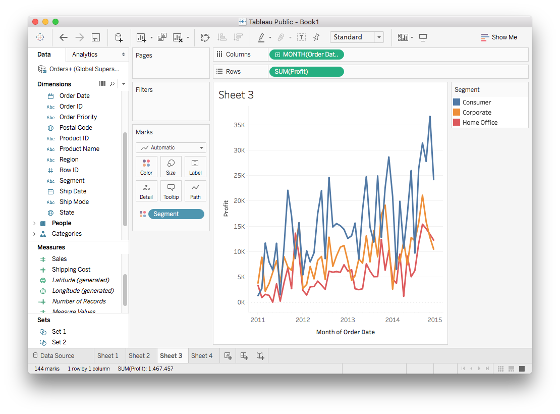
Most often you'll be encoding data with color. This is easily done in Tableau, simply drag the field to "Color" in the Marks card. Below I made a line plot of the monthly profit, split up by Segment.
Color options
Clicking on "Color" in the Marks card lets you change the color palette used to encode the data.
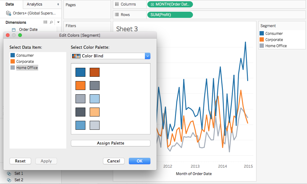
In the menu, you can select the palette then click "Assign Palette" to change the colors and click Apply or OK to make the change. It's possible to change individual colors too, just click on a data item then on a color in the palette.
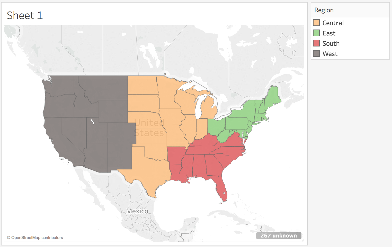
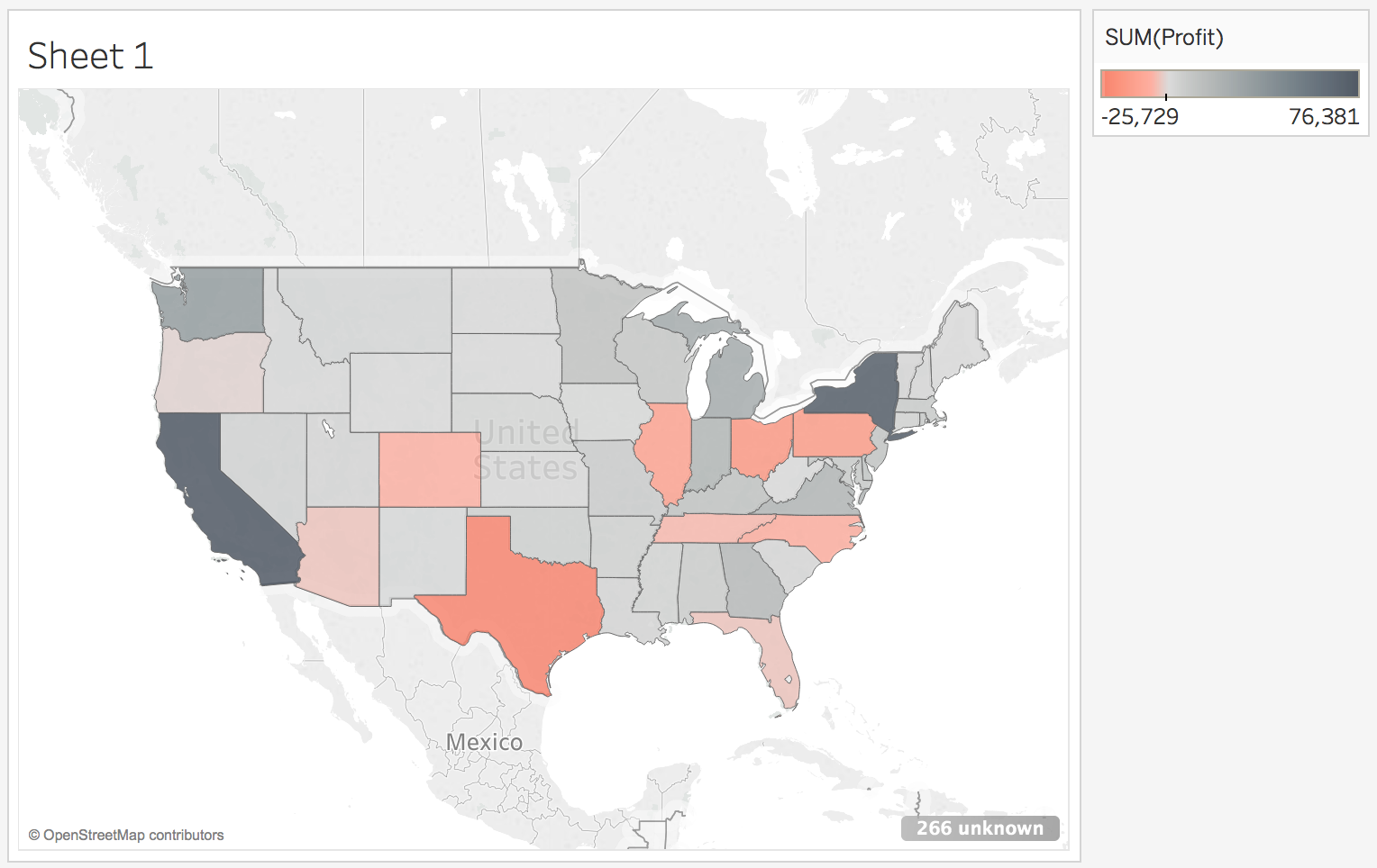
Color is great for encoding data on maps too. Below are a couple examples.
If you aren't encoding data with color, you can still change the color of the graphical elements. Clicking on "Color" brings up a color picker that will set the color for the marks as shown below.
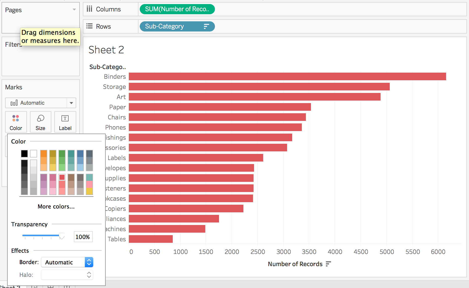
Color is one of the most important factors for making attractive and understandable visualizations. In the recent update to version 10, Tableau (the company) spent a lot of time getting it right. You can read about their efforts here.
Size
Dragging a field, either discrete or continuous, to "Size" will encode the data in the size of the markers. You'll most often use this encoding in a scatter plot, commonly known as a bubble plot.
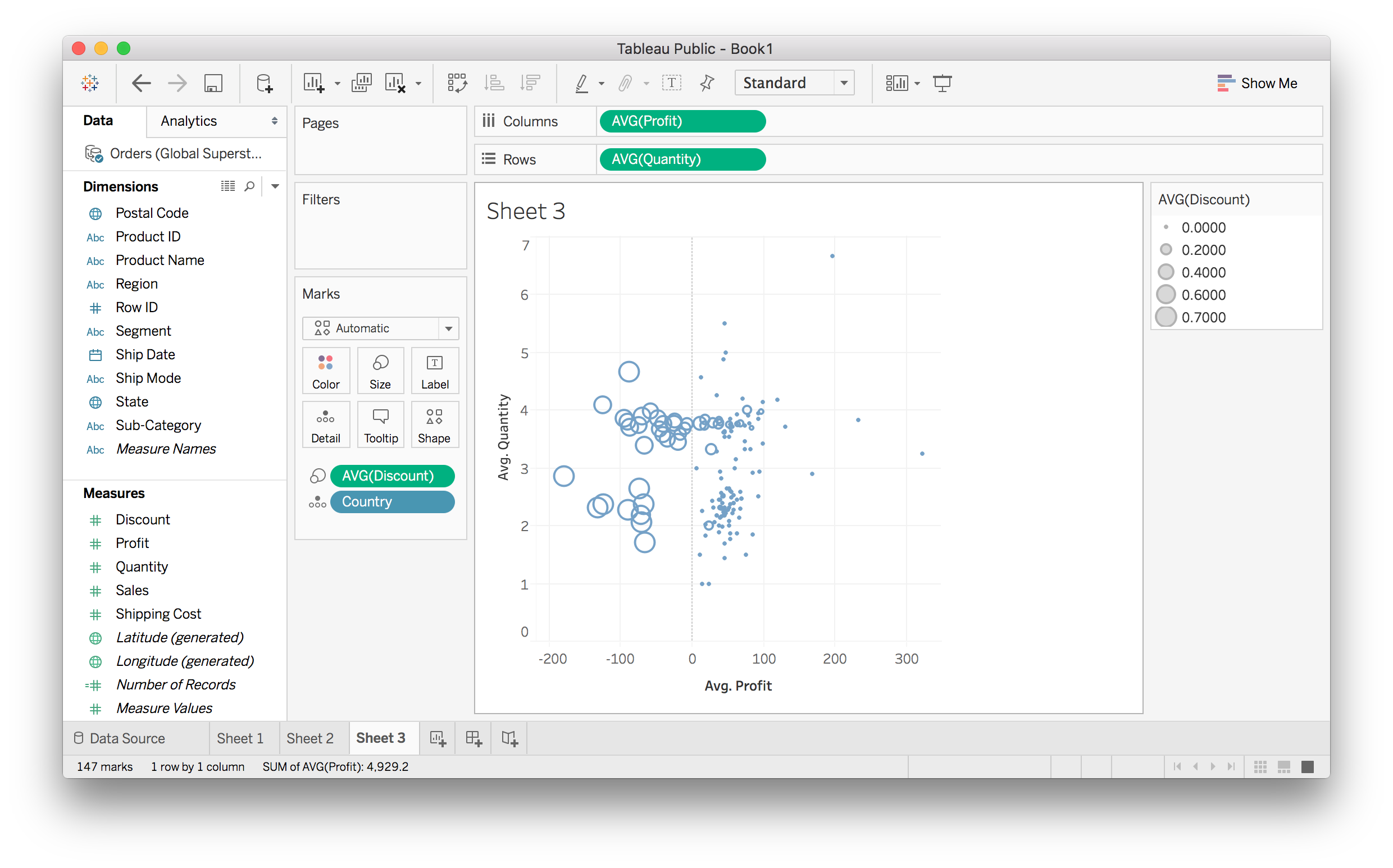
Above I made a scatter plot with average quantity vs average profit for each country. I encoded the average discount using the size of the markers, it's clear that discounts are responsible for the countries with negative profits.
As with color, if you aren't encoding data with size, you can set it by clicking on the Markers card and moving the slider.
Shape
As with color and size, you can use the shape of the markers to encode data. You'll want to use discrete data only for this. Also, if you have too many categories the shapes are too difficult to identify.
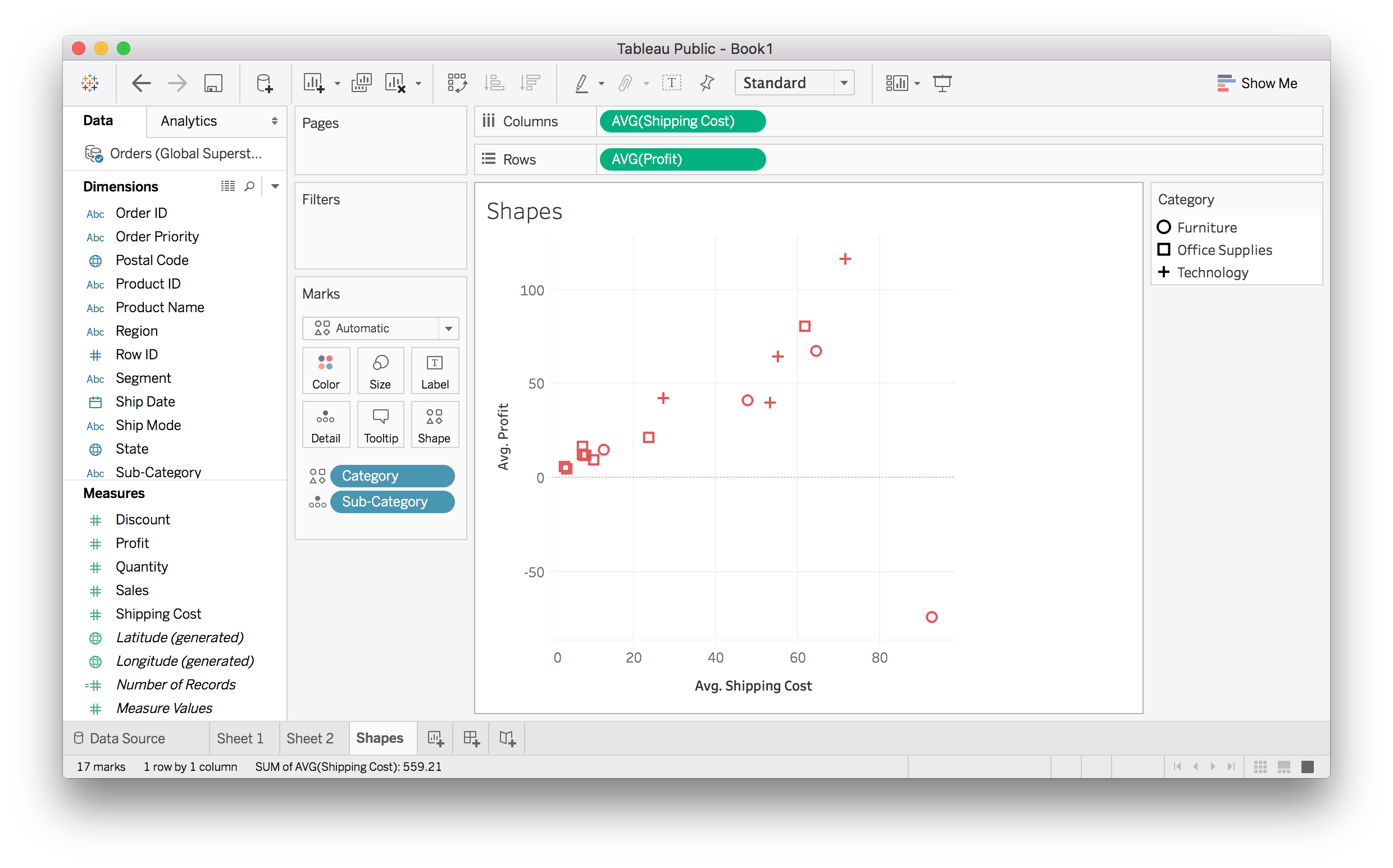
You can set the shape if you aren't encoding any data with it.
Other Cards
The "Detail" card allows you to bring in a field without any visual encoding. This enables you to increase granularity without adding any graphical effect.
The "Label" card adds in labels for all of our markers.